12 Minutes

A Conversational Analytics Exploration: Why is Denmark happier than Burundi?
Analyzing a World Happiness dataset using Natural Language Queries
What is happiness?
While this is an interesting metaphysical question, we can attempt to answer this question in a data-driven way. Specifically we shall take global survey data on happiness scores from different countries, and try to uncover some of the factors behind happiness, and why some countries seem to be happier than others. We shall use our conversational analytics tool, Qbo, to explore the world happiness data in an easy manner. In this blog article, we shall talk about the dataset, how we configured this dataset within Qbo, and how we chatted with Qbo to extract some interesting findings on happiness.
About the Dataset
The dataset was taken from Kaggle which is an annual publication of the United Nations Sustainable Development Solutions Network.
The dataset includes the rankings and scores of national happiness based on a Cantril ladder survey. The survey asks respondents to think of a ladder with the best possible life for them being a 10 and the worst possible life being a 0 and to rate their own current lives on that scale.
Along with the happiness scores are scores for various important life factors, like the following:
- Economy, GDP per capita
- Social support
- Healthy life expectancy
- Freedom
- Generosity
- Perceptions of corruption
- Family
The values associated with each of these factors describe the extent to which each factor contributes in evaluating the happiness in each country. More specifically, the values represent estimate the extent to which each of the six factors – economic production, social support, life expectancy, freedom, absence of corruption, and generosity – contribute to making life evaluations higher in each country than they are in Dystopia, a hypothetical country that has values equal to the world’s lowest national averages for each of the six factors. They have no impact on the total score reported for each country, but they do explain why some countries rank higher than others.
Finally, there is a column called Dystopia, which represents the unexplained components of happiness … i.e. the extent to which the six variables either over- or under-explain average 2014-2016 life evaluations. These residuals have an average value of approximately zero over the whole set of countries.
Data preparation and configuration
The dataset can be downloaded from here. For the purposes of this analyses, we concatenated the 5 csv files for the different years into a single file using a simple Python script.
There are many ways to set up data sources within Qbo like uploading an xlsx file using the UI, directly connecting to a database, etc. For this study, we will store the data in a MariaDB database and point Qbo to this database. We created a table named happiness on Mariadb as follows:
CREATE TABLE happiness (
country_region varchar(80),
happiness_rank decimal(3,0),
happiness_score decimal(4,3) null default null,
economy decimal(4,3) null default null,
family decimal(4,3) null default null,
health decimal(4,3) null default null,
freedom decimal(4,3) null default null,
corruption decimal(4,3) null default null,
generosity decimal(4,3) null default null,
dystopia decimal(4,3) null default null,
social_support decimal(4,3) null default null,
year varchar(80),
day date);
And then, we uploaded the csv file to mariadb as follows:
LOAD DATA LOCAL INFILE '{file location}.csv' INTO TABLE happiness FIELDS TERMINATED BY ',' LINES TERMINATED BY '\n' IGNORE 1 LINES;
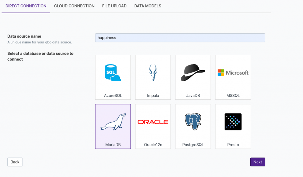
After the data is successfully loaded, we are ready to connect the data with Qbo. In the UI, we used a direct connection, chose MariaDB as the data source and named the dataset as happiness.
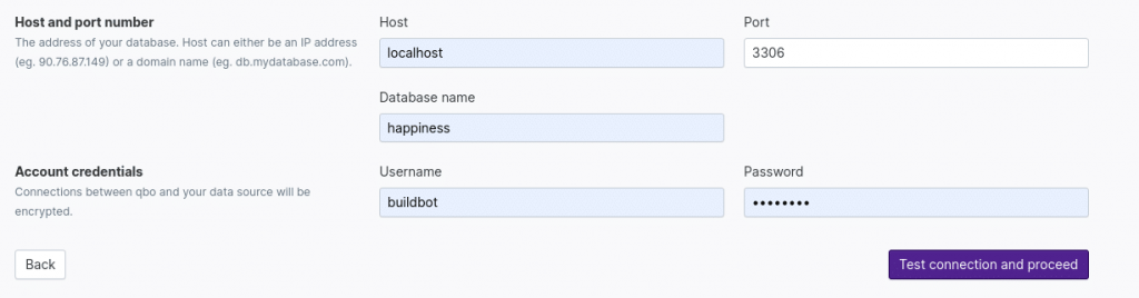
After that, account credentials and database information are required. After completing, you can press the “Test connection and proceed” button.
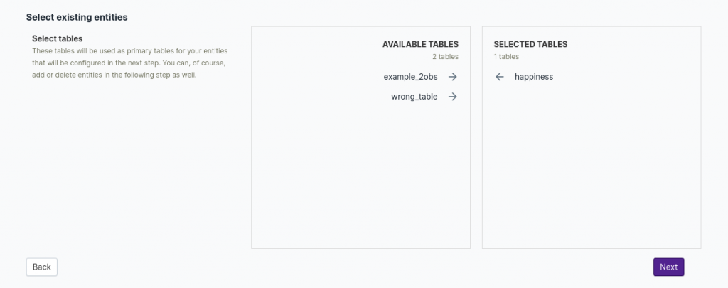
If the connection is established without an error, you can see all the tables inside the database. In our example, we will proceed with the one table named happiness.
Selected tables are defined as entities, in the attributes section we can enable/disable desired attributes, change data types, and add synonyms to increase efficiency and accuracy while querying. We kept it for this part.
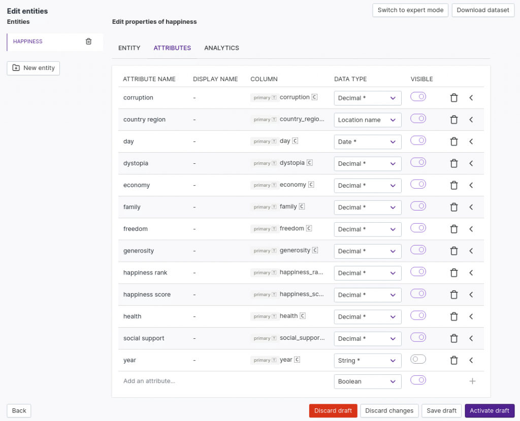
In the entity section, we need to define the primary key attributes. Here, we define country, region and day as primary key attributes. Also, we define day to be the default temporal attribute. This will help answer questions related to filtering or grouping based on time, e.g., daily, monthly and yearly queries.
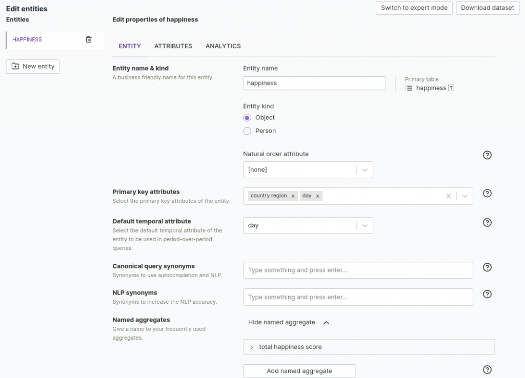
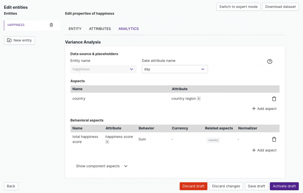
Last, but not the least, we configure variance analysis. This is one of the out-of-the-box diagnostic analytics supported by Qbo. Documentation on how to configure the analyses can be found from here. We can now ask questions like “compare total happiness score for 2019 and 2018” with the variance analytics.
After clicking the save and activate button, we are set our business intelligence tool for exploring the dataset.
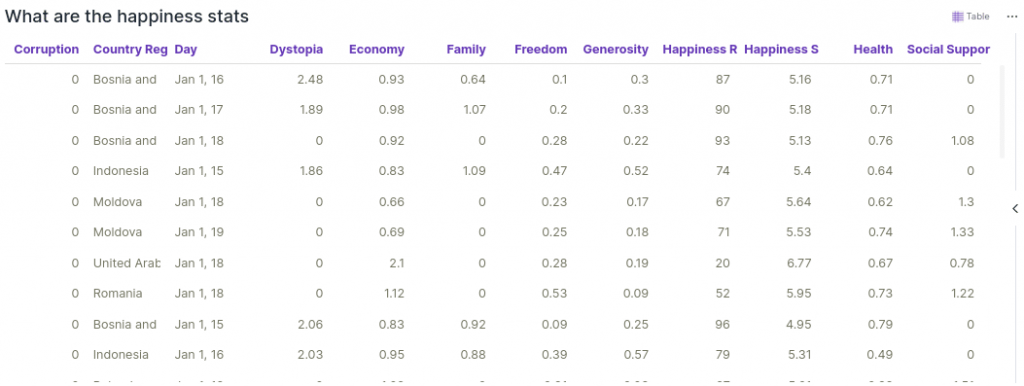
Let’s get familiar with this dataset using conversational analytics. Let’s start by looking at a sample of the data. We can do this with a query of the form “What are the happiness stats”. As we can see, the various life factors and happiness scores are in the expected range of 0 to 10.
Getting familiar with the dataset
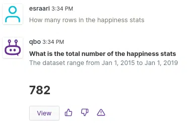
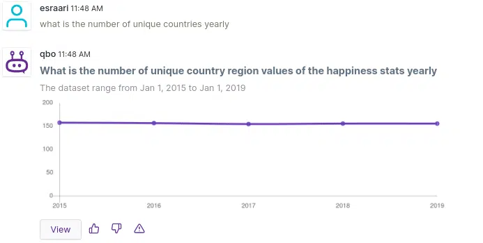
Also, there are 782 observations in the dataset. Now, let’s figure out how many countries have joined this survey yearly.
It can be seen that the number of countries surveyed varies a little bit from year to year. For example, there were 158 distinct countries in 2018; but it decreased to 156 number in 2019.
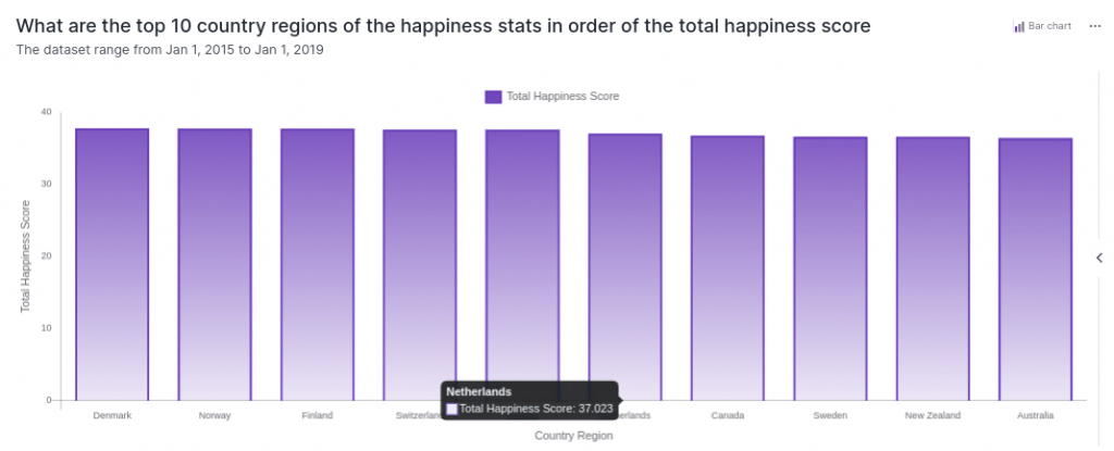
Now let’s find out the countries which have the highest and lowest total happiness scores, so that we can see if there is anything odd in the dataset.
Note that total happiness score, by default, refers to the sum of the happiness scores across the years.
Using augmented intelligence, the tool is able to show that Nordic countries have the highest total happiness scores.
Article To Check: When does a conversational analytics bot have AI? (Part 1). Read

When we ask for the bottom 10 countries in order of total happiness score, we get Northern Cyprus and North Macedonia as some of the countries with the lowest levels of happiness.
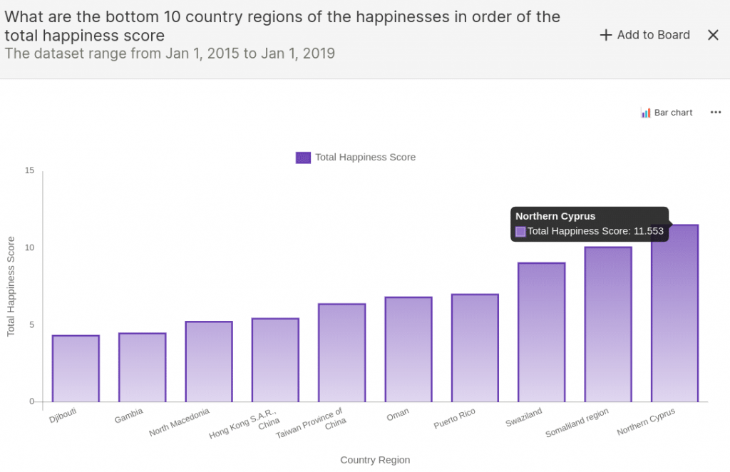
However, we need to take these figures with a grain of salt. As it turns out, the survey misses some countries in some years.
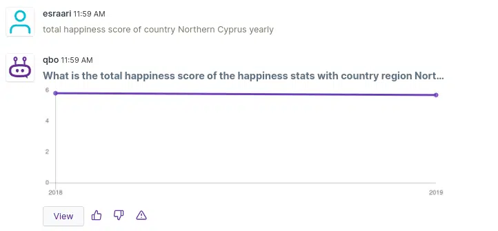
The next figure shows that there is no entry for North Cyprus for 2015, 2016, and 2017. Therefore, we need to be careful about usage of metrics like “total happiness score”.
Digging into the data
Now let’s take a deeper look into the data and try to answer the following interesting questions using conversational analytics.
- Which are the happiest and most unhappy countries?
- How is the happiest country different from the most unhappy country?
- How have happiness and life factors changed annually since 2015?
- What are the most important parameters that affect overall happiness?
- Which are the happiest and most unhappy countries?
Article for Reference: Effective Questioning in Conversational Analytics. Read
Happy & Unhappy Countries
In the data preparation part, we argued that the average function is more correct instead of sum, because the countries surveyed changes year by year.
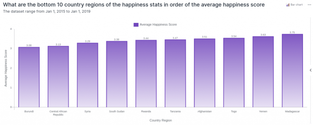
Now let’s look at the top 10 most unhappy countries based on average happiness score. It can be seen that we get very different results compared to the previous query on ‘10 bottom countries in order of total happiness score’.
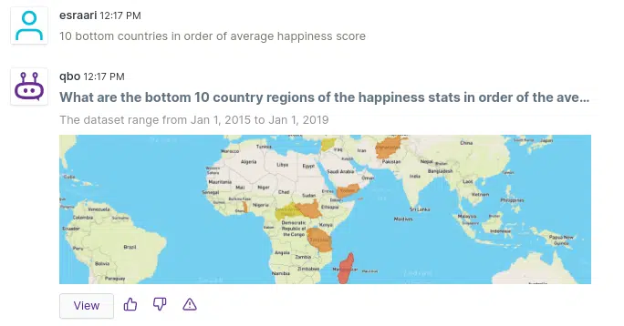
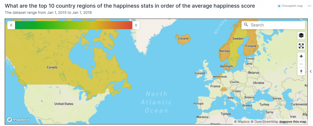
We preferred to use the choropleth map vizy (short for visualization) in order to see countries on the map better. East and central African countries seem to dominate the result and Asian countries follow.
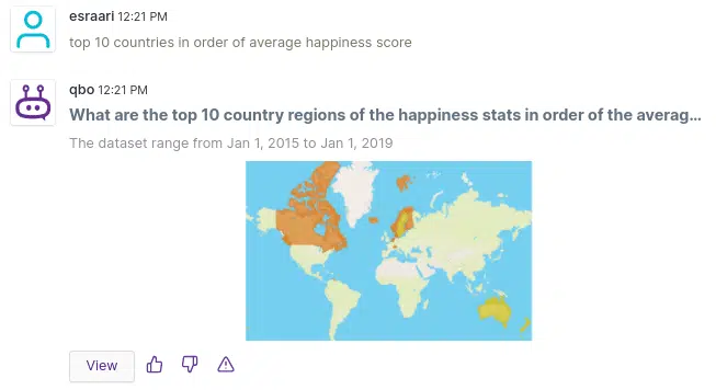
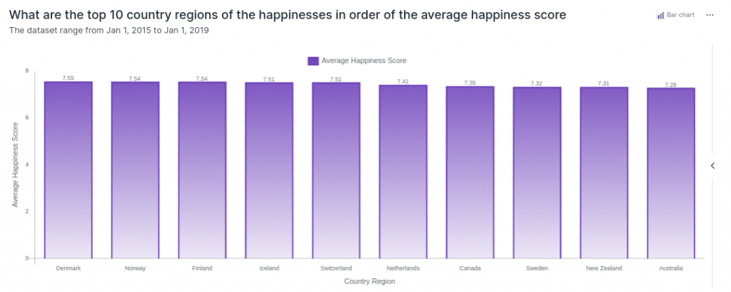
As for the top 10 happiest countries, the results are the same as earlier, when we used “total”. The Nordic countries are happiest
- Denmark,
- Norway,
- Finland,
- Iceland
- and lastly Sweden.
Apart from Nordic countries, others that manage to rank among the top 10 are:
- Switzerland
- Netherlands
- Canada
- New Zealand
- and Australia
How is the happiest country different from the most unhappy country?
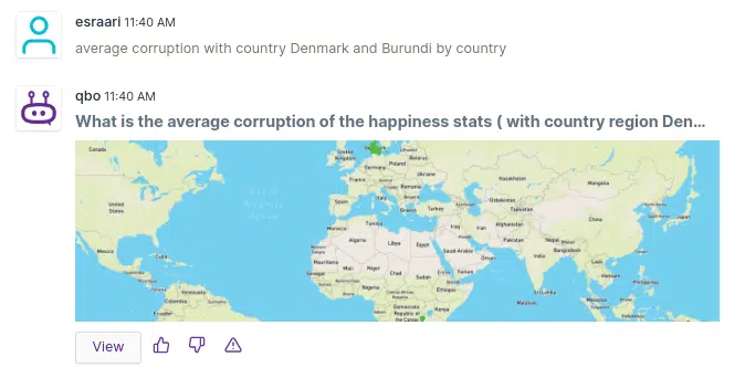
While Denmark was the happiest country, unfortunately, we identified that Burundi as the most unhappy country in the previous question. Therefore, let’s try to compare these countries’ life factors.
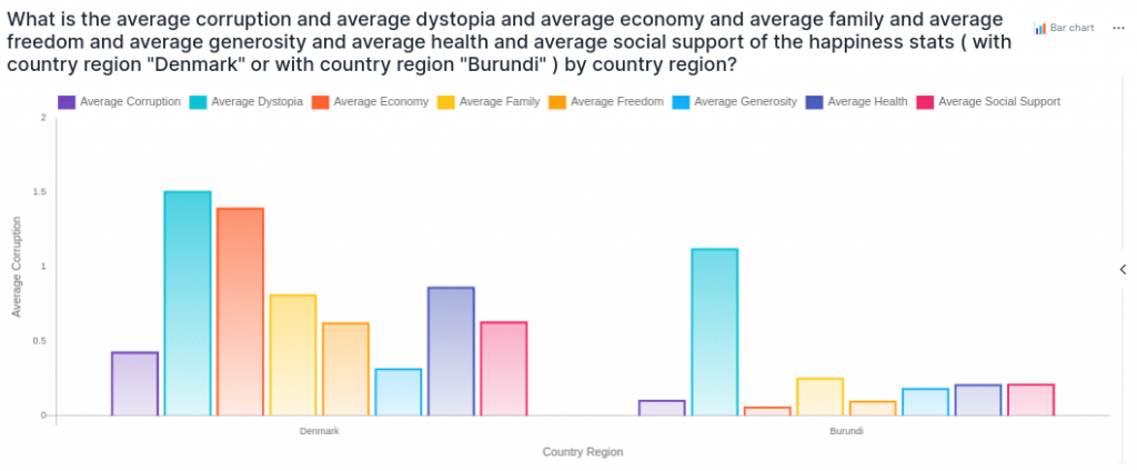
Let’s start by checking the average corruption for Denmark and Burundi.
With the help of Augmented Intelligence Qbo gives the ability for users to drill down on a result in a board view. This is an alternative to exploring the dataset conversationally.
So, lets add this chart to the board and switch to the board layout. Let’s change the choropleth chart to table and add some other metrics one by one while using add a new metric button.
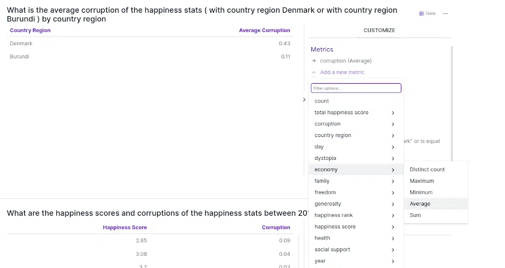
This is what we get after adding several metrics related to the various life factors. We can visualize this as a table or as a bar chart.
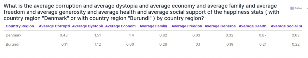
It can be seen that all life factors for Denmark have higher values than those of Burundi. All of these contribute to making Denmark’s happiness score so much higher.
There are 2 factors that stand out though — economy and health score. Denmark has a much better economy and health score than country Burundi. Family score follows them in 3rd place.
Economic & Health Score
Let’s dig further into the economy and health scores.
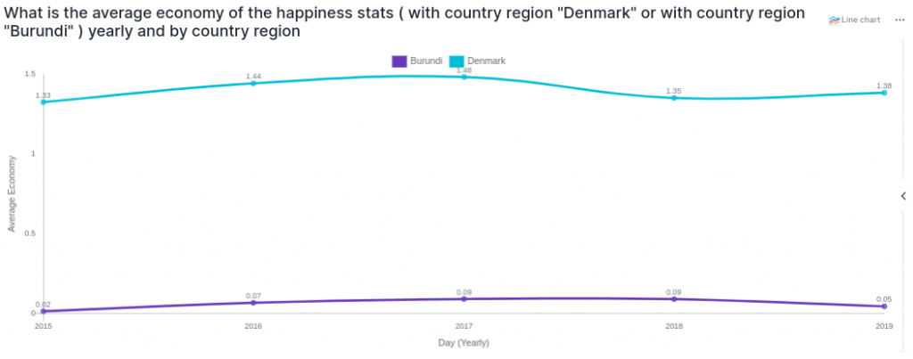
Let’s start with economy. Let’s see whether it has significant yearly changes for both Denmark and Burundi. This can be achieved by grouping the data both yearly and for each country.
We do this by adding a “by yearly and by country” statement to our nlp query.
It can be seen that because the economy is an important factor that differentiates Denmark and Burundi, Denmark has a significantly higher economy score for each year. Interestingly, they have different trends in terms of economy. Whereas Denmark’s economy experienced a decrease in 2018, Burundi managed to keep it at least stable. However, as Denmark’s score started to improve in 2019, Burundi’s score dropped compared to the previous year.
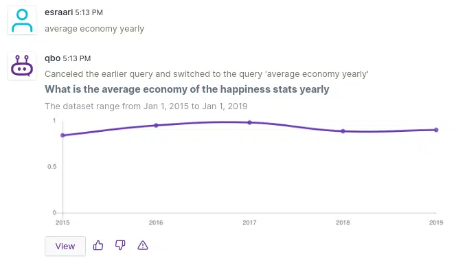
One hypothesis is that Burundi is affected by events in the world economy with a certain lag. Yet to be able to make this interpretation, we need to understand how the average economy score globally changed year over year.
Let’s ask Qbo with its skiled conversational analytics to answer this question.
Apparently, the change in average economy score is very similar to Denmark’s trend. In fact, this figure may thus partially confirm our previous assumption, but of course this information should be examined in more detail by looking at the economic events in the country in detail.
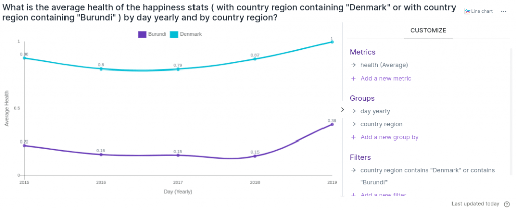
Let’s move to another life factor(health) and explore it by customizing our previous vizy via the UI. Recommended Article: Making data-driven decisions a reality.
We deleted the economy(average) metric and added health (average) in the Metrics section. Both have a very similar trend but apparently Denmark’s score is still very high compared to Burundi’s. While both were in a decreasing trend until 2017, they started to increase from 2018.
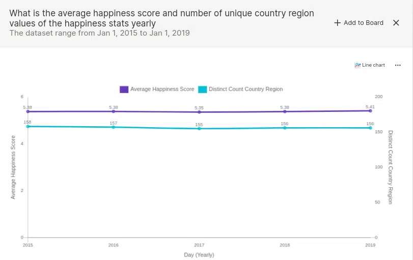
How have happiness and life factors changed annually since 2015?
The following figure shows yearly changes in the number of countries covered in the survey and the average happiness score worldwide. There is a slight decrease in both average happiness score and number of distinct countries for 2017. However after that point, both of them started to increase.

Comparing different years using Qbo Variance Analysis
In Qbo there is a special analytics module called variance analytics that helps users to understand why some metric has increased or decreased in a given time period compared to some baseline (Details of the analytics can be found here).
For example we can just type “compare the total happiness score for 2015 and 2019”.
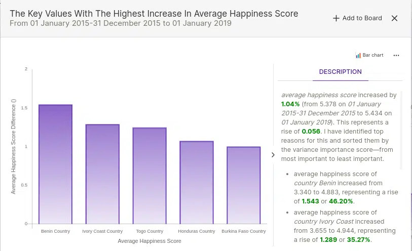
In the description part, firstly, the information about whether the main metric is increased or decreased in the specified time intervals is given. Secondly, the reasons for this change are explained. In this example, Qbo explains the top reasons for the increase in average happiness score are the increase in the happiness scores of countries like Benin, Ivory Coast, Togo, Honduras and Burkina Faso. It is quite interesting that several West African countries have seen marked improvements in happiness from 2015 to 2019.
Now let’s figure out how other life factors change year by year.
- It seems that the economy has been relatively steady over the years.
- Health has improved in the last couple of years, i.e. 2018 and 2019.
- Dystopia and family scores have been removed from the happiness score calculation in the last 2 years. They were replaced by a new metric called social support. Perhaps one reason for this change is that dystopia and family scores seemed to be changing more than the other scores.
- Also, unfortunately, there is a decrease in generosity and corruption scores
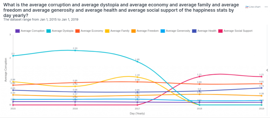
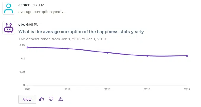
Hint: We did not actually type that long natural query in the chart above. We actually asked a simple question (“average corruption yearly”) Hint: as shown below, and then we added other metrics from the customization tab in UI. Qbo automatically generates an equivalent natural language query to reflect the customizations performed from the UI.
What are the most important parameters that affect overall happiness?
For this question, we wanted to examine how countries’ happiness scores change with other life factors. Let’s use Qbo to visually inspect the relationship between happiness and the various life factors. One good way to examining the relationship between two variables is to draw a scatterplot.
Let’s start with freedom score.
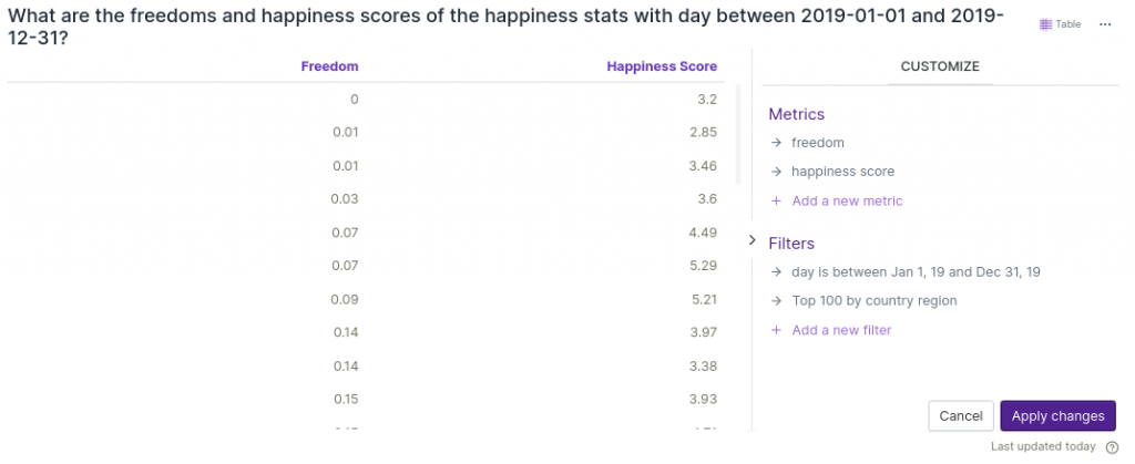
If we type “what is the freedom and happiness score for year 2019” , Qbo directly recognizes the question and converts to a sql query and gets the data using augmented intelligence.
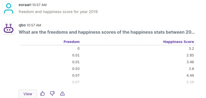
Qbo decides to display this as a table, because it does have a restriction on how many points can be displayed in a scatter plot.
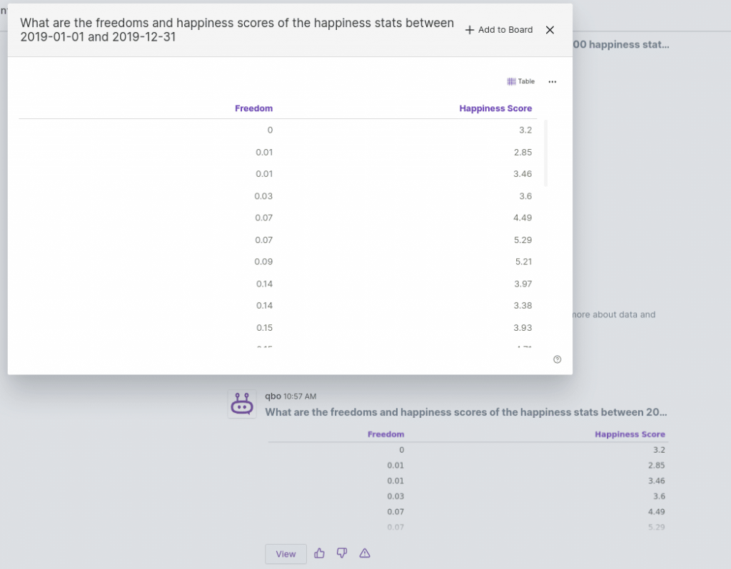
So, let’s try to limit the number of points. We can do this by first adding to a board.
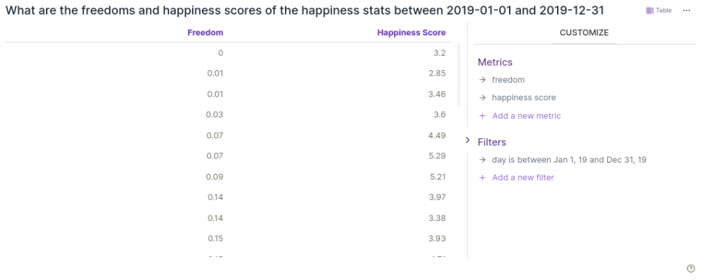
Qbo allows the user to easily edit their charts and tables in the Board section even without asking questions. The following figure shows the default version of the table when we added it to the board. Let’s add additional filters to reduce the number of points so we can visualize it with a scatter plot chart.
To filter top 100 countries, we just need to add a new filter while hovering the mouse over the country region. After that we just type 100 and click.
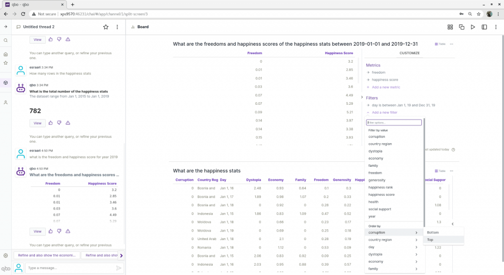
As you can see the following right now we have the newly added filter(Top 100 by country region) and let’s apply changes!
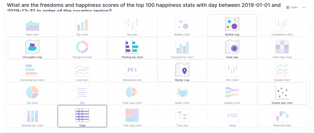
Here we have a filtered dataset and a scatter plot chart ready to use.
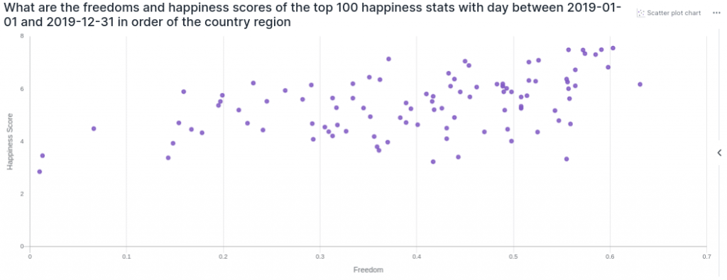
Here we can see that when the freedom score increases, the happiness score also increases as expected. Let’s go over other attributes while just changing the life factor part in nlp query.
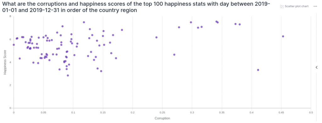
In particular, we put life factor in the first place and happiness score came second because Qbo thinks that first attribute as independent variable and second one as dependent variable. According to the conversational analysis, we have seems that overall happiness score increases with corruption, however it doesn’t look as clear as freedom score.
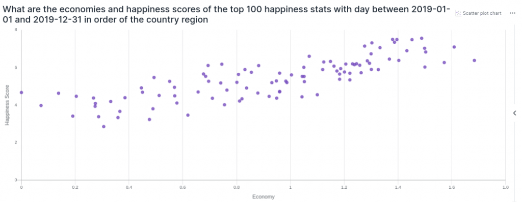
Now let’s move forward with the economy score. Apparently we found one of the most correlated factors. It seems we can establish a line of best fit through a dataset of these two variables.
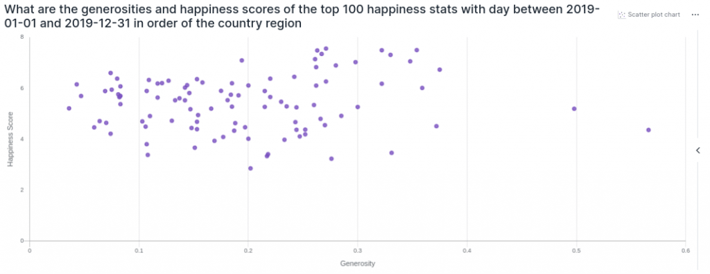
Following figure shows how overall happiness score changes with generosity score. Apparently there is a positive correlation but not as strong as an economy score.
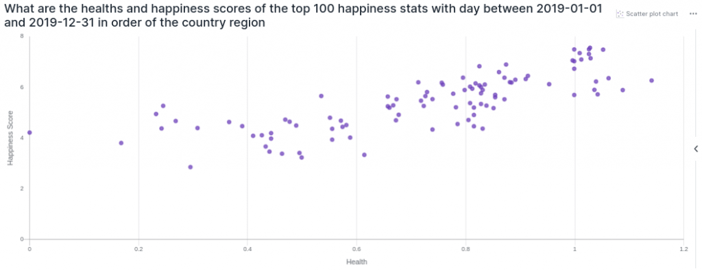
Here we see a strong variable again, health. Like the economy score, overall happiness score increases strongly with health score.
For the social support score, we can say the same comment we made for the health variable.
Again apparently, we have a strong positive correlation between happiness score and social support factor.
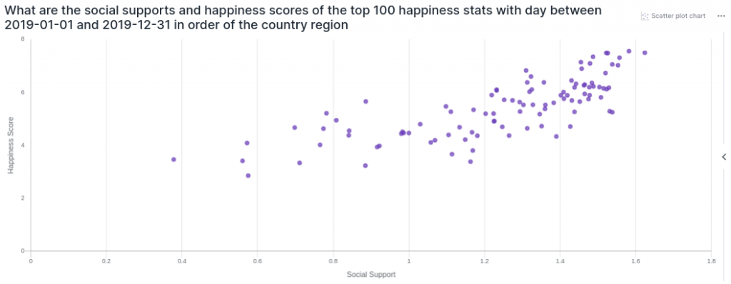
To summarize, economy(GDP per capita), social support and health(life expectancy) scores have the most influence on the happiness score. Also, happiness is less dependent on generosity and corruption scores, because they have a dispersed distribution with the happiness score compared to the other metrics. In fact, remember that we also recognized economy and health factors as the most important reasons for the difference in happiness between Denmark and Burundi.
Access your Qbo Now in Microsoft Teams, or get your personal Qbo with 14 Days Free Trial.
You can learn all about Qbo Here.